Do MUNI trains really move along a needle-straight trajectory? According to the transit agency’s map they do, but as any passenger who has made more than a few trips on the commuter rail can attest, the routes don’t feel straight. Centripetal forces nudge you to one side of your seat each corner MUNI rounds. Yet, for as many corners you count, the map refuses to budge, insisting the route is straight.
So, what’s going on? It turns out that MUNI irons the heavy rail’s curvature into smooth lines on its maps for the benefit of passengers. In reality, it doesn’t actually matter whether the lines are curved or even if the map is made to scale; its main function is to alert the riders which stop is next and whether that stop is a transfer point. What matters, of course, is that we arrive at our desired destinations on time.
This is the bias that shapes the MUNI map, and the same choices of straight lines, bold colors and simplified urban geography are reflected in renderings of San Francisco’s BART, cable car and ferry lines as well. Because maps of all sorts inflict these small edits on often-unsuspecting readers, only a robust atlas — a compendium of maps — can visualize the true scope of a city: its political microclimates, its attractions, its contradictions.
In that vein, the Oakland Museum of California’s “You Are Here: California Stories on the Map” exhibition runs the gamut from U.S. Geological Survey plans to activist cartographies of air pollution in Oakland to crowdsourced maps that pay tribute to San Francisco’s beloved Japantown. A visitor can gaze nostalgically at extinct flora and fauna or peer into the future with predictions of sea level rise across the Bay Area.
From this perspective, maps suddenly feel urgent and politically charged. If MUNI isn’t telling us the whole truth, if it can so casually misinform us, what other half-truths are hiding behind other visual aids we take for granted every day?
By the nature of their work, mapmakers are redactors — and heavy-handed ones at that. In order to select for readers the story they need to hear, cartographers sieve out specific details from all the potential information about a given place — everything from street layout to pollen concentration — before creating a useful product. This process of winnowing the complexities of the world into a simple visual requires withholding troves of information for the sake of utility. Too much data makes for a cluttered, and therefore useless, map. Nuance disappears naturally when you move from 3D to 2D. Small wonder, then, that geographer Mark Monmonier believes “not only is it easy to lie with maps, it’s essential.”
Even the most innocuous of choices comes with consequences. Take color scheme, for instance, specifically the color red, whose meaning shifts drastically in different contexts. If you were a person of color in the 1930s, red portended a home loan or mortgage denied if printed over your neighborhood.
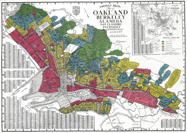
“You Are Here” showcases a 1937 map produced by the Home Owners’ Loan Corporation that explains why. Though infamous today for its role in segregating the United States, the government agency’s notoriety can be traced back to a color scheme it chose nearly a century ago. In the 1930s, HOLC began categorizing urban neighborhoods on a sliding scale to designate which districts were safest for a bank to lend to: “Type A” areas (green) generally corresponded with affluent, suburban neighborhoods and, consequently, a secure loan; “Type B” (blue) signaled less secure borrowers; and “Type C” (yellow) a yet riskier loan. HOLC reserved “Type D” (red) for the neighborhoods housing people whom the corporation determined to have the highest likelihood of a loan default: Black neighborhoods, gay villages, Chinatowns, Little Manilas and other racial and ethnic enclaves that for decades received little by way of city funds for upkeep. Thus was born the term “redlining,” which survives in today’s speech as a relic to the terrible reality of de jure segregation.
Rather than shying away, “You Are Here” memorializes the history of segregation as an ongoing struggle for adequate public housing, school desegregation and fair lending practices with this map of the East Bay. Patterns “of segregation and inequity,” the accompanying plaque reads, “persist in today’s cities.”
Chromatic shorthands extend to politics, too. In today’s United States, red is Republican, but it is also Communist: one domestic, the other considered foreign, insidious. The Communist “Reds” were America’s bitter enemies during the Cold War, a conflict waged by many capitalists from what would come to be called “red states” by the 2000 election. Red like Mao, red like George W. Bush.
By now, every self-respecting American recognizes this abbreviation: “Red states” lean Republican, “blue states” Democrat and “purple states” swing between the two from election to election. In the lead up to Election Day, contested purple states make headlines, but most maps of electoral outcomes drop the color altogether. When results trickle in from individual states — “Florida goes to Donald Trump” — the tight races in “purple” states disappear. Hesitancy and ambivalence at the voting booth in these battleground states evaporate. A state turns either solidly red or solidly blue — a “white lie,” as Monmonier would have it.
In the past years, Fox News has capitalized on a similar flaw in the county-by-county rendering of election results to push its own vision of America. “Tucker Carlson Tonight” epitomizes the phenomenon. From his show’s inception in 2016 through 2020, Carlson often broadcast in front of a looming reproduction of the red-and-blue map of America, an image that also served as one of the show’s logos. It’s a foreboding backdrop: A crimson ocean flecked with a spatter of blue, thereby suggesting that more Americans voted for Donald Trump than for Hilary Clinton.
The slant is clever in that it is difficult, at first blush, to refute the visual. The stunning wall of Republican red seems to speak for itself. But the popular vote is measured in ballots cast, not by county landmass. (What the map does depict is the outsize influence that thinly populated, rural communities have on electoral politics. To give an idea of scale, consider that a Wyoming senator’s vote weighs 57 times more than a senator’s from California.)
The slant is clever in that it is difficult, at first blush, to refute the visual. The stunning wall of Republican red seems to speak for itself. But the popular vote is measured in ballots cast, not by county landmass. (What the map does depict is the outsize influence that thinly populated, rural communities have on electoral politics. To give an idea of scale, consider that a Wyoming senator’s vote weighs 57 times more than a senator’s from California.)
Nevertheless, the inaccurate map persisted. In September 2019, Lara Trump, a former television producer and daughter-in-law of Donald Trump, recycled the visual during the first of the president’s impeachment inquiries. Over it was emblazoned the slogan: “Try to Impeach This.”
As it happens, Trump was impeached — twice, in fact — but the map never was. Conspiracies still swirl around the 2020 election approaching 12 months later. Despite being characterized as the most secure election in American history by a bipartisan coalition of officials, over half of Republicans in May 2021 believed the election to be fraudulent or stolen, according to an Ipsos poll. Strange how easily a humble little map can tap into a reservoir of fury, stoking the red-hot rage that pours like magma from aggrieved voters. Strange, too, to imagine the potential role the map played in perpetuating such a grand conspiracy.
There is indeed a distinctive political overtone to the work on display at OMCA. The West Oakland Environmental Indicators Project makes a strong appearance, galvanizing support for the organization’s green agenda, and so does the reality of queerness in the Bay Area.
One niche in the exhibition houses a glowing map sculpted in neon by Lebanese artist Omar Mismar. To produce it, Mismar wandered the streets of San Francisco perusing Grindr, a popular location-based dating app used mainly by gay men. On his long-walk looking, Mismar chose a man he found desirable and, with the app’s aid, attempted to get as close as he could to his potential beau. Proximity was the name of the game. After the trek, he committed his route to paper and created a neon sculpture from the blueprint. Depicting the lengths so many go to chase passion, this particular map is part of his “The Path of Love” series, which traces 30 such quests over a 30-day period.
By any metric, the installation lacks a “use” for anyone except the artist to commemorate his romances that never were. What, we wonder, does another man’s meanders through San Francisco have to do with me? Maybe he buried a joke in here somewhere about traveling along “straight” lines in a city renowned for its vibrant queer community … But soaking up the warm, carmine glow of Mismar’s neon, the piece takes on a didactic mantle. Prize your own personal maps, the geographies you hold dear, the memories you attach to beloved haunts, it suggests. Cast them in neon — or maybe bronze.
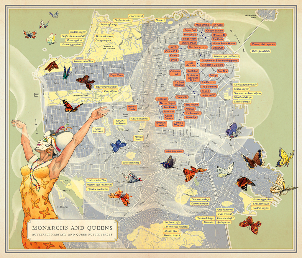
The journalist Rebecca Solnit gestures at a similar point in “Monarchs and Queens,” a map that visualizes the overlap between San Francisco’s queer public spaces and its local varieties of butterflies. First published in “Infinite City: A San Francisco Atlas” and illustrated by the artist Mona Caron, the map depicts a drag queen with her arms raised whimsically and a broad smile painted on her face. You can tell she’s a local — her makeup reminiscent of San Francisco’s Sisters of Perpetual Indulgence, a nonprofit-meets-drag advocacy group. Her delicate gossamer wings unfurl as if to lay claim to the city she calls home.

Like Mismar’s neon, the map lacks immediate utility for travelers or tourists in the City by the Bay, but Solnit isn’t interested in practicality as much as the metaphors of emergence, belonging and habitat. The drag queen “came out” from her chrysalis a more beautiful evolution of herself. There’s a similar, though distinct, discourse in the trans community. Those who haven’t yet confronted their gender identity are endearingly dubbed “eggs”: gestating, unhatched and therefore not fully developed into their most genuine selves. As a viewer, I found Mismar’s and Solnit’s maps soothing, almost nourishing. Sanctuaries for queer people abound in this city.
“You Are Here” teaches visitors to read a map in the same way a student is taught to read a book: carefully, critically and with an attention to its creator. Ask questions. Grapple with the imagery. Allow the author to guide you on a journey, but consider how they arrived at their conclusions. The data that are left out of a book — or a map — are often as important as the data you’re gifted.
“You Are Here: California Stories on the Map” will be showing at the Oakland Museum of California through 2022. The museum is open 11 a.m.-5 p.m. Wednesdays-Sundays, and general admission is $16. For tickets and information, visit museumca.org.