This story was originally published by EdSource. Sign up for their daily newsletter.
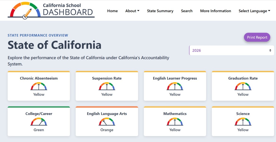
The California Department of Education this week released the annual California School Dashboard, the state’s multidimensional, multicolored look at student, school and district achievement.
The dashboard was designed to offer parents a quick look at student results, as well as to provide data for guiding school improvement and for holding districts accountable. Trying to serve these different purposes has created a data system that’s complex and comprehensive, often useful, but also daunting for first-time parent users.
The California Department of Education has translated the dashboard into multiple languages and produced dozens of flyers, videos, and an annually updated Dashboard Communications Toolkit. This is a good place to start.
Here are some answers and tips to help parents navigate the dashboard experience.
What’s the purpose of the state dashboard?
The dashboard gives an extensive look at every school, charter school and school district’s yearly performance as measured by ratings on eight state indicators. They are standardized test scores, of course — English Language Arts and math in grades 3 through 8 and grade 11, English learners’ progress, and, in 2026 for the first time, science.
Along with high school graduation rates, there are ratings for chronic absences, though only through grade 8, and suspension rates; both measures underscore the importance of engagement and school climate to student success.
There is also a measure of how well high schools prepare students for college and careers. It has expanded to include 14 measures. They include:
- Satisfying the A-G course requirements for admissions to UC and CSU campuses
- Passing multiple AP and International Baccalaureate courses
- Successfully completing two semesters of credit-bearing college or CTE courses
- Attaining a seal of biliteracy or a seal of biliteracy
- Completing a CTE pathway or pre-apprenticeship program
- Passing the Leadership/Military Science and Armed Services Vocational Aptitude Battery Test
- Demonstrating work-based learning.
Piedmont Unified Schools on the California School Dashboard
Beach Elementary
Wildwood Elementary
Havens Elementary
Piedmont Middle
Piedmont High
Millenium High
What’s the point of using colors?
Rating performance by color serves a double purpose. There are five: blue signaling the highest achievement, green, yellow, orange, and red signaling the lowest performance. Each color reflects a blend of two factors, evenly weighted: the current year’s test score or rate, and the change from the preceding year to credit improvement or signal a decline deserving attention.

A school’s goal is to achieve green or blue for any indicator, but a sharp change from the results of students the year before can elevate an otherwise yellow score to green or lower it to orange.
Clicking any indicator on a district or school’s overview page will lead to additional details.
For example, clicking the math score “odometer” for San Jose Unified reveals that students averaged 25.4 scale points below the threshold for proficiency or “meeting standard” in math in 2025-26 — a significant gap. Its students also gained 1.5 points from the year before. The combination is rated orange, two levels below green. The same template applies to other indicators.
Why is there no overall rating for a school’s or district’s performance?
Unlike other states’ dashboards, the State Board of Education chose not to give a summative or top number or rating for a school or district, in order not to overemphasize test scores, at the expense of other important measures. It also wanted to draw attention to achievement gaps among student groups, which would be hidden by focusing on an average score for all students.
How do student groups factor into the dashboard?
Tracking achievement gaps among 15 different student groups, including eight racial and ethnic groups, drives the dashboard. Every student group with a statistically valid number (usually a minimum of 30) receives a color rating on every indicator in every school and district.
While five of San Jose Unified’s student groups scored in the orange range, English learners, foster youth, long-term English learners and students with disabilities scored in the red band. White students achieved a green rating, and Asian students and students with two or more races were rated blue.

Every district’s dashboard includes grids — the 5×5 Placement Reports — that lay out the color rating for every school in the district on every indicator. Here’s the 2025 math 5×5 grid for San Juan Unified, for example (The 2026 grid will be released Dec. 15). It shows that of the district’s 40 schools on the grid, 12 rated orange, 10 were yellow, seven were green, six were blue and five were red.
As with all districts with student groups receiving a red rating on an indicator, San Jose Unified must then address low achievement in its Local Control and Accountability Plan, better known as the LCAP. That’s the three-year improvement plan in which districts must list, among other requirements, an action item, including funding, for every student group with a red rating.
Can you compare districts’ ratings on the state dashboard?
No, but you can compare schools within each district.
Other organizations have included a comparison tool in modifying the state dashboard.
What are local indicators?
The dashboard includes priorities for which there are no statistically valid comparable statewide data or assessments, but nonetheless are vital for successful schools. These include family engagement, school climate and access to a broad course of study.
The State Board of Education requires that districts analyze each local priority and report back to the public annually. Examples are the results of local school climate surveys and the district’s actions to improve public engagement. For example, county offices of education must report on how well they are coordinating services for foster youths and expelled students.
How does dashboard information drive improvement?
Districts in which at least one student group is rated red on two or more priority areas, such as low reading scores and high chronic absenteeism, are designated eligible for “Differentiated Assistance.” They are encouraged to seek guidance from county offices of education or the California Collaborative for Educational Excellence, a small state agency, on how to improve. Differentiated Assistance is voluntary and applies only to districts.
Since the dashboard’s first year, in 2017-18, more than three-quarters of districts, charter schools and county offices have qualified for differentiated assistance, with more than 80% of those identified two or more times.
In 2026, only 144 school districts will qualify for differentiated assistance, down from 418 last year. Recognizing a need to focus on fewer districts with more intensive, effective help, the State Board revised the criteria, and districts will receive assistance for three years, instead of one year.
Districts are selected based on poorly performing subgroups as well as districts’s overall scores receiving red ratings. Most of those qualified because of the low ratings for students with disabilities and long-term English learners, and in some charter schools, for low ratings of Hispanic students, according to Department of Education analysis.

This story was originally published by EdSource.